Scaling VOO’s customer care app

The brief
VOO, a telecommunications company, has decided to invest in design and user experience (UX) by putting together a great internal UX team. After meeting Central at one of our Umami Talks, they asked us to help them redesign myVOO, their customer care application.
As with any digital product, myVOO evolved a lot in the 2 years after its launch. It gained new functionalities and content, and the list of upcoming features was longer than ever. Problem was, the original UX patterns could not adapt to all the changes and the copy was starting to become inconsistent.
We agreed to tackle those challenges by working together on 2 parallel tracks:
- UX track: we developed a prototype that included all the current features, while using new UX patterns that would allow the app to scale with changing user needs and new business objectives.
- Copy track: we audited the existing copy, reworked the texts in myVOO, and updated the copywriting guidelines by adding actionable examples and a section on accessibility.
The Research Sprint
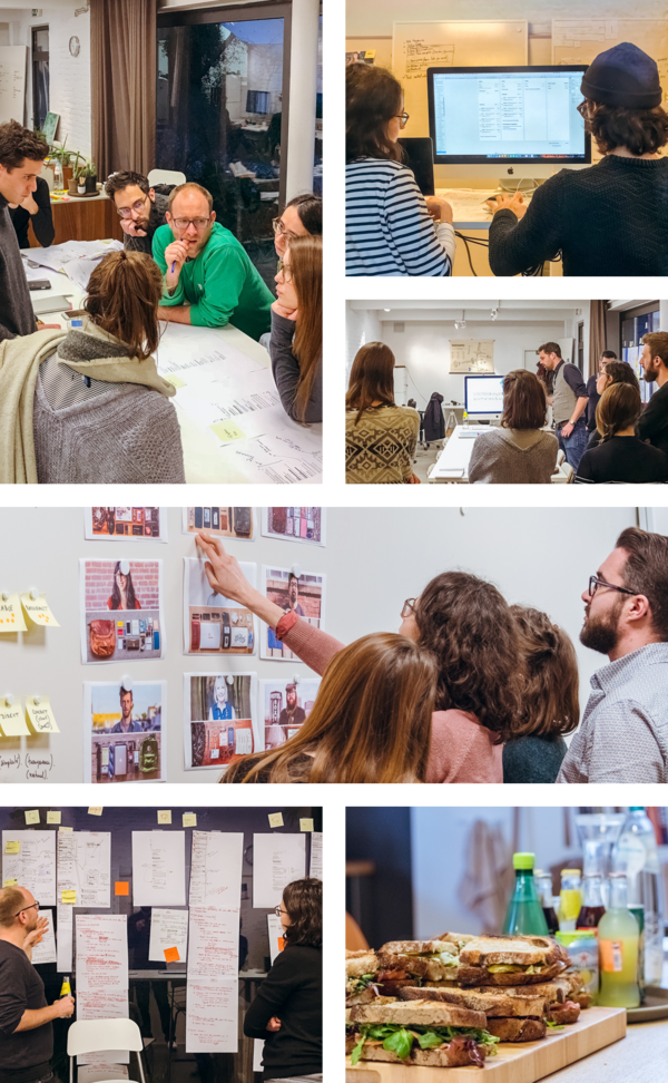
We started by familiarizing ourselves with myVOO. We took note of its shortcomings, but also of its strengths in order to avoid throwing out the bad with the good. We also interviewed members of the Customer Care and Product teams and read through dozens of user survey results. Armed with this knowledge, we kicked off a week-long Discovery Sprint with VOO’s service design team.
The Discovery Sprint
The goal of a sprint like this one is to clearly understand the issue at hand. To do so, we began by re-stating the product’s mission and defined an actionable personality to match it. Then, we created user personas and a list of tasks they’d want to accomplish using myVOO (“jobs to be done”), and mapped out the app’s information architecture.
From there, we drew concrete paper wireframes of key screens for mobile. Doing this allowed us to explore solutions for navigation interfaces and UX patterns, and clearly identify the copy that had to be written.
By the end of the week, an entire wall was covered with paper wireframes that showed what needed to be prototyped both in terms of UX and of copy. Everybody was on the same page and we all agreed on the solutions we wanted to test.
The Conception Sprint
A Conception Sprint is the phase of a project during which we create a prototype to test with users. Based on our paper wireframes, we built a realistic mobile prototype using Sketch and InVision. We worked hand-in-hand with 2 of VOO’s designers, their Digital Marketing Manager and the Head of Digital Service Design to make sure our designs were accurate and complete.
Involving the internal team in every phase of a project made the handover a lot smoother and allowed us to work fast. When questions are answered in real time, it’s much easier to move forward quickly.
We ended the Conception Sprint with a series of guerrilla user tests to verify our assumptions and to check that users could complete the 5 most important tasks on myVOO.
The results
By the end of these 3 weeks, we had a tested digital prototype with consistent copy, and an improved copywriting style guide.
